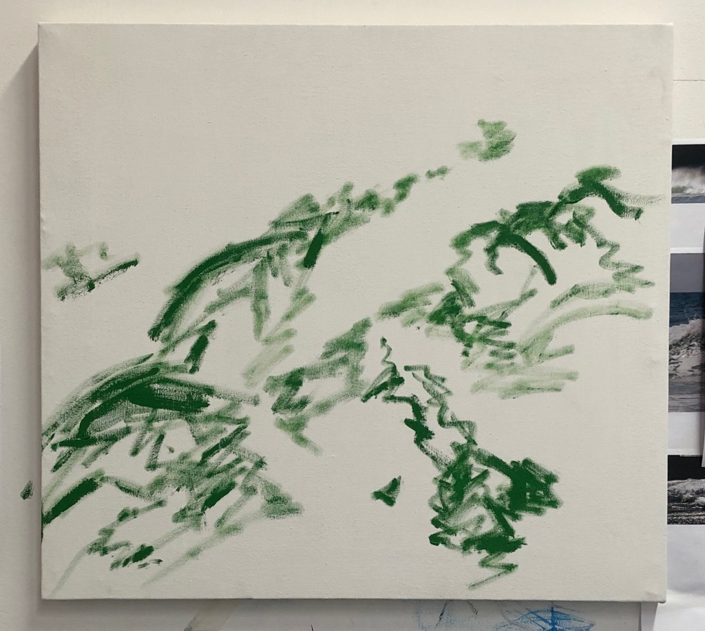
I began by adding plastic netting and ripped sections of a plastic bag onto the canvas. I then roughly drew out the outline of my composition in oil paint.
Thinning the oil paint I applied blue and green hues onto the surface of the canvas to create a background layer.
Next I painted in the rocks using brown and grey hues.
I continued to fill in the base layer by overlapping different tones this time. I mixed different shades of greens and blues and applied them individually on top of each other. In some parts of the composition I used a larger paint brush to gently blend the different coloured layers together.
I continued adding the different hues with a palette knife before applying the white water with a palette knife. I had to keep stepping backwards and re-evaluating my composition to see which areas needed more highlights and which areas needed more shadows.
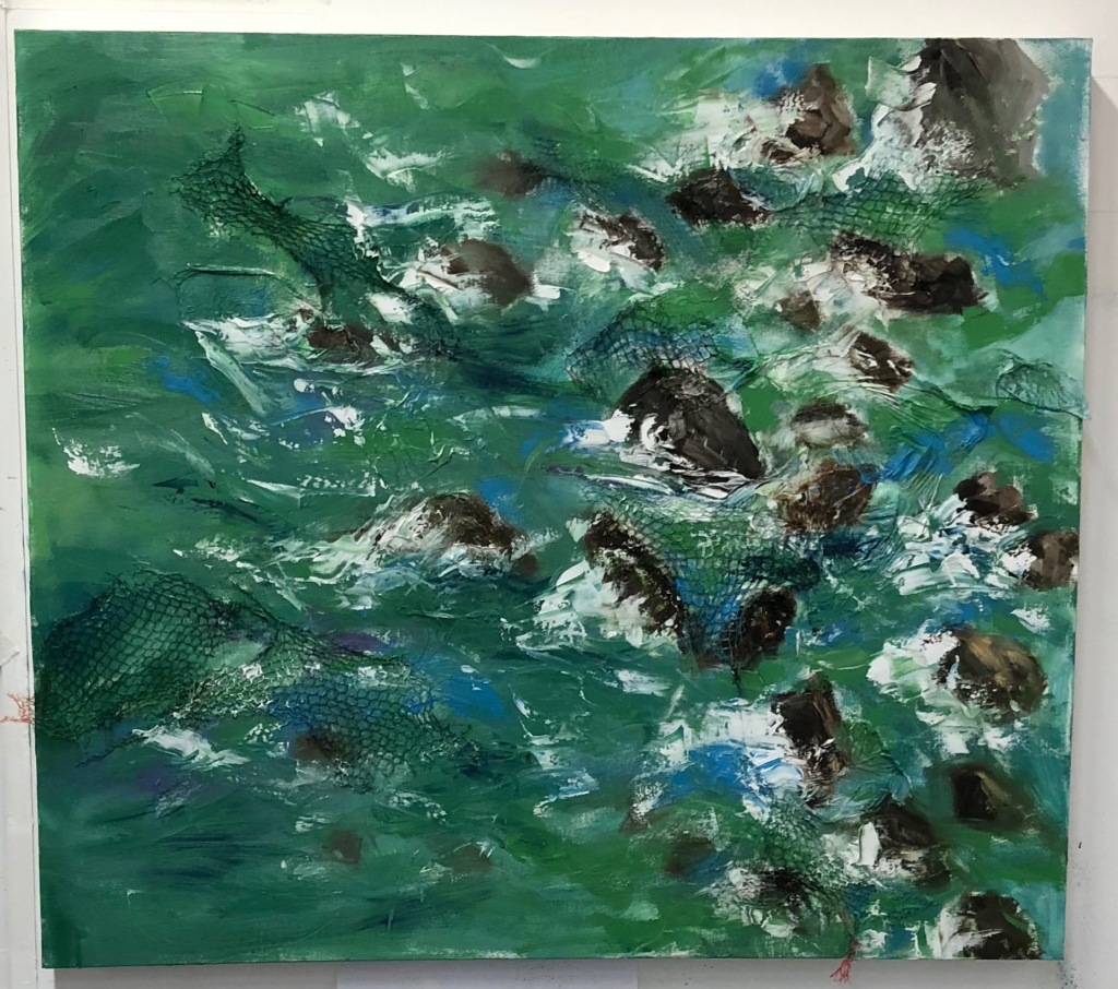
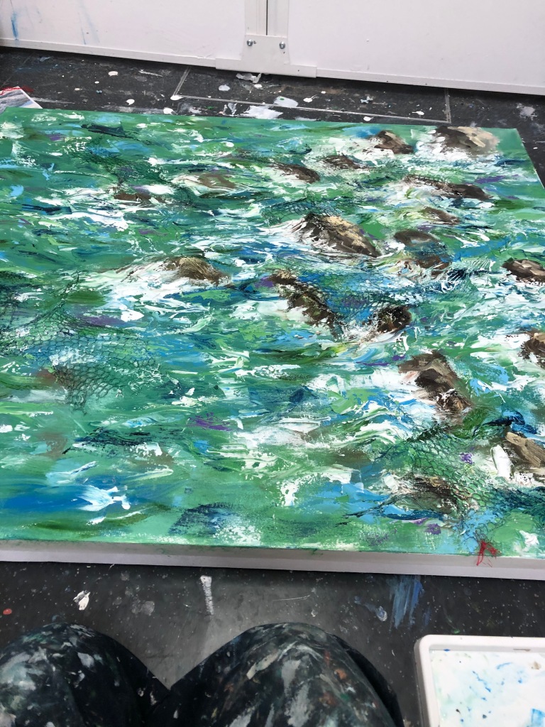
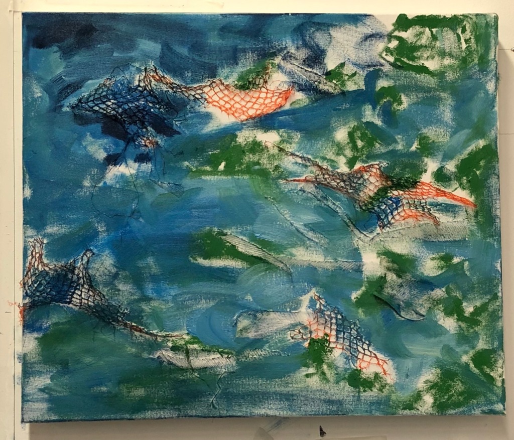
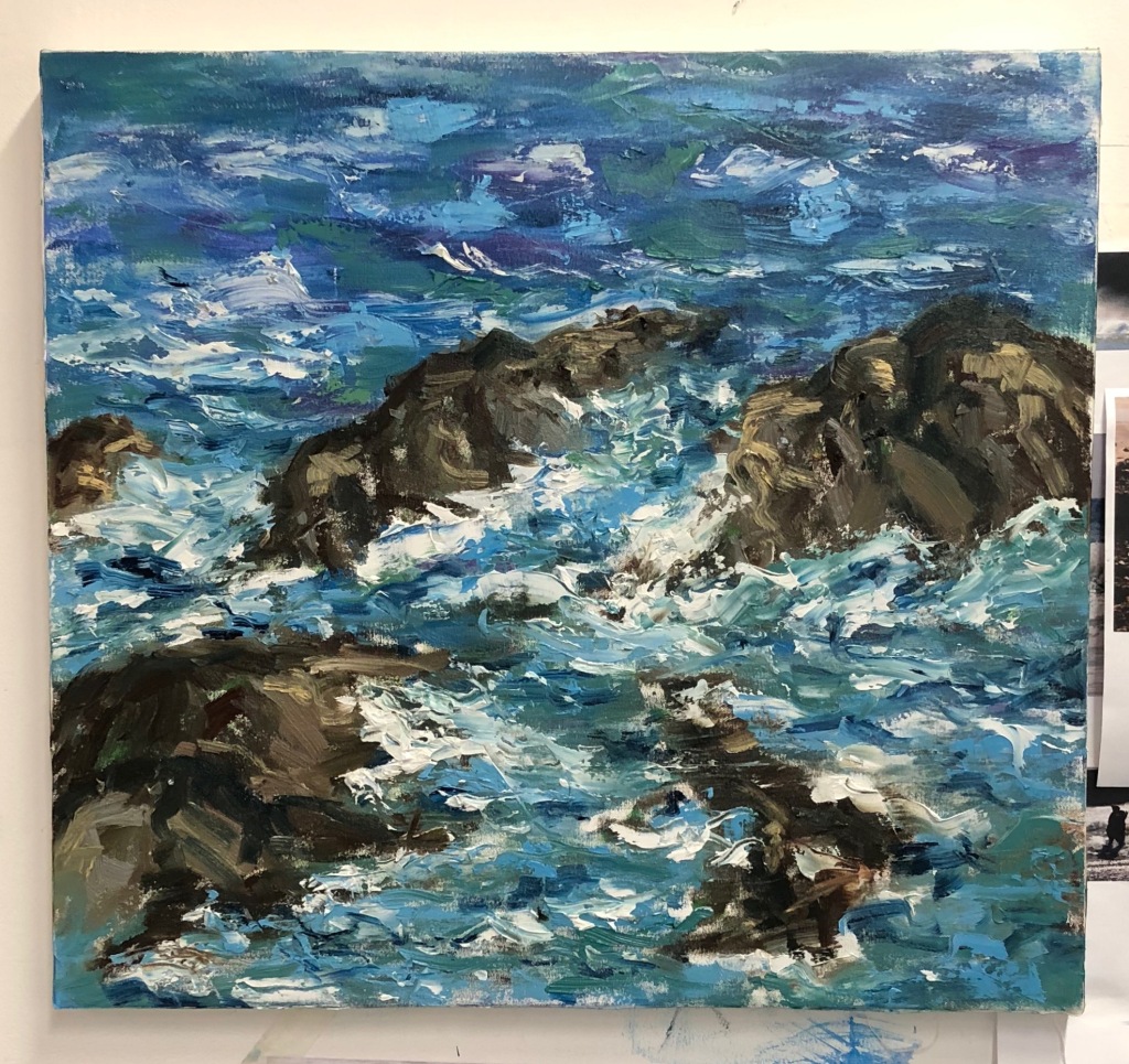
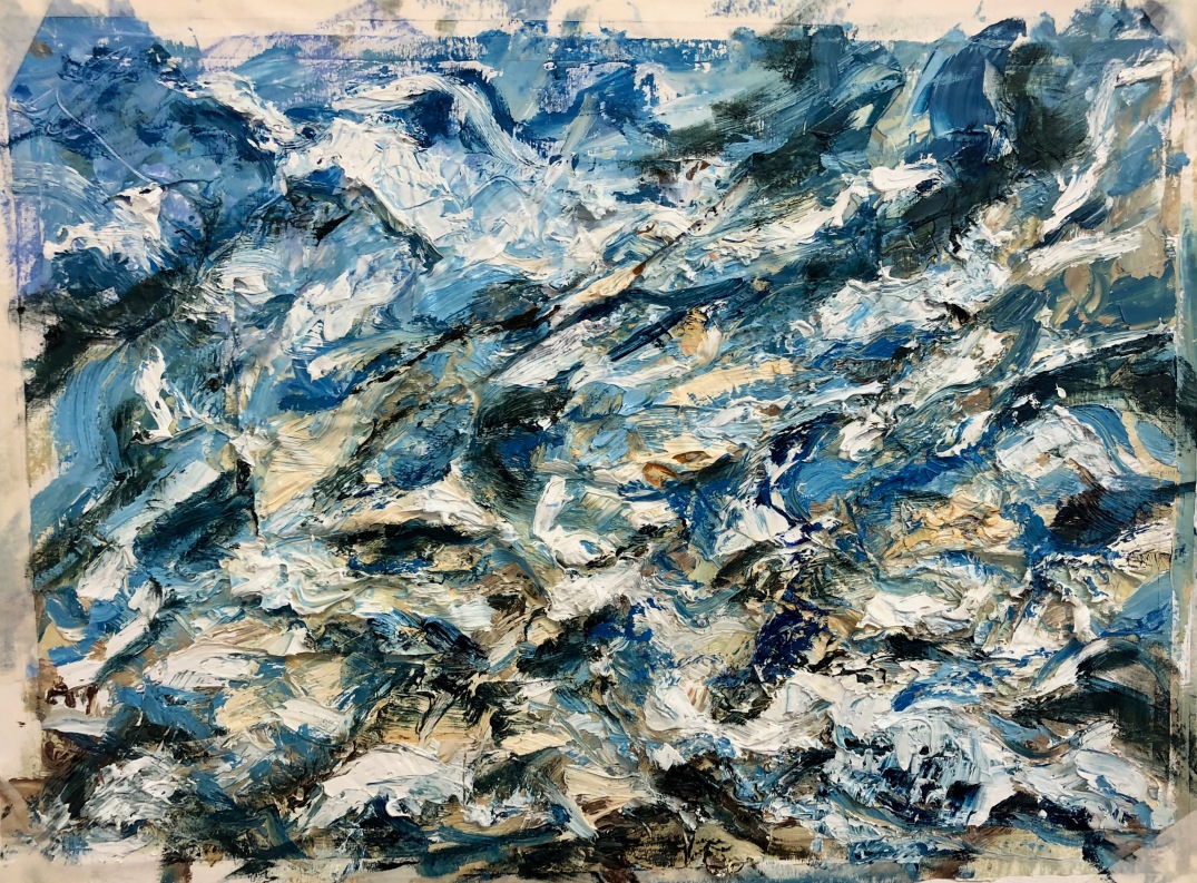
Overview so far
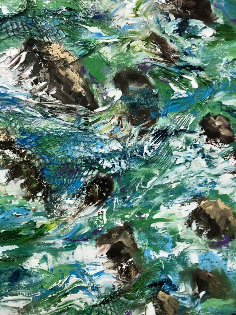
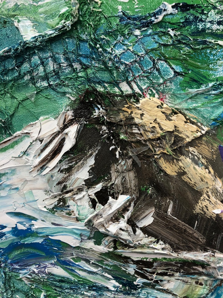
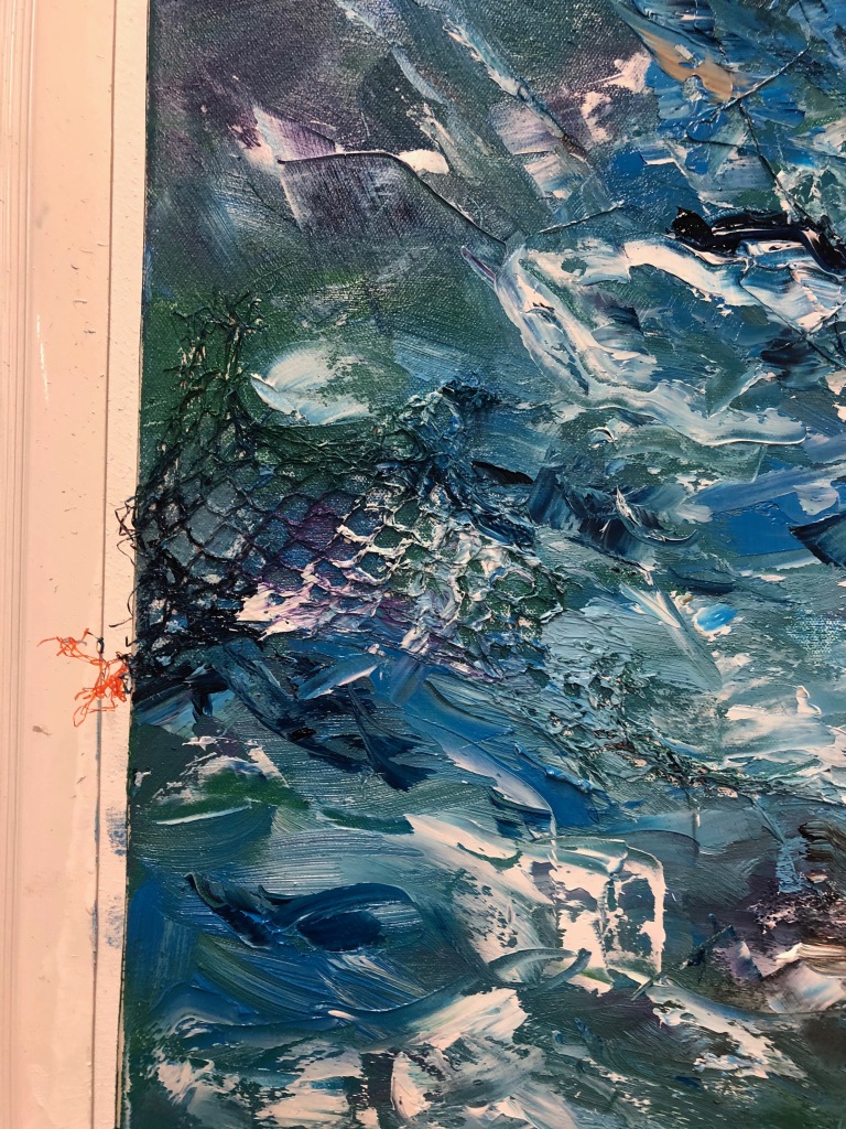
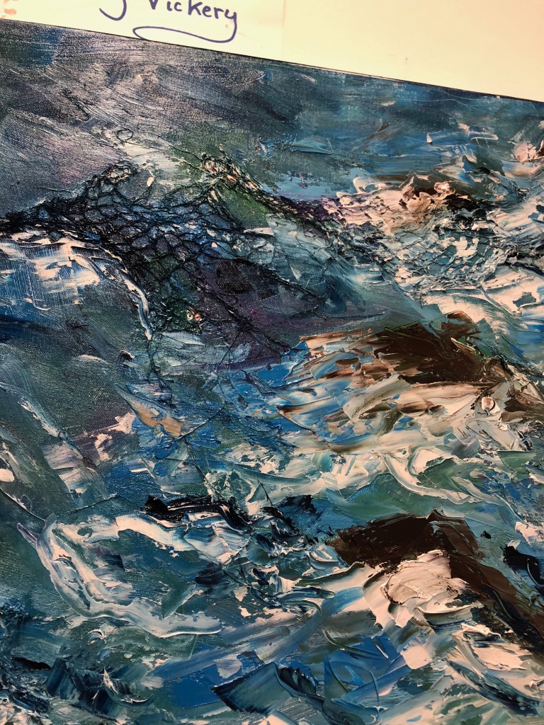
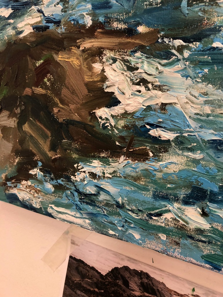
Close up 1
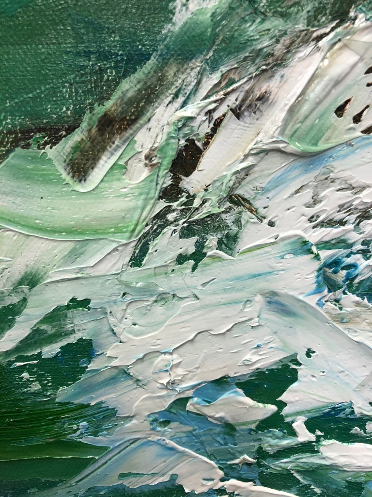
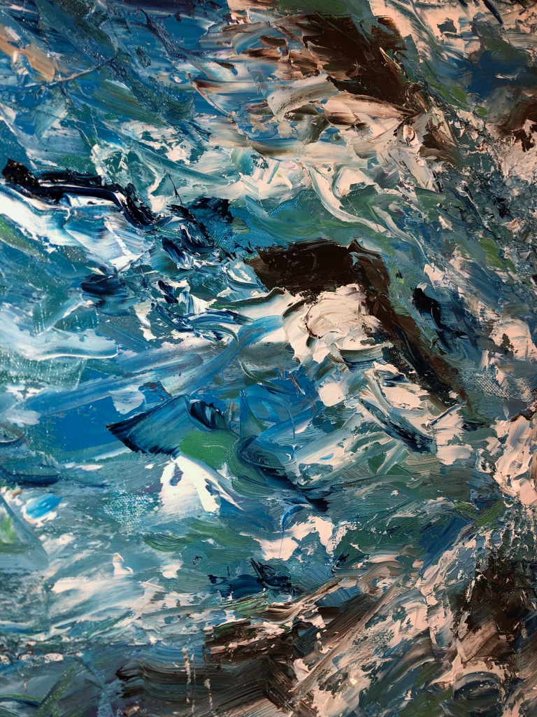
Close up 2
I then took the canvas off the wall and began applying the small pieces of cut of plastic. I carefully placed them all over the canvas to ensure they would be visible to the viewer
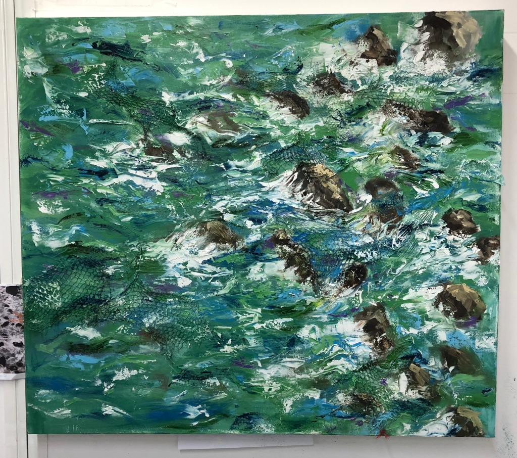
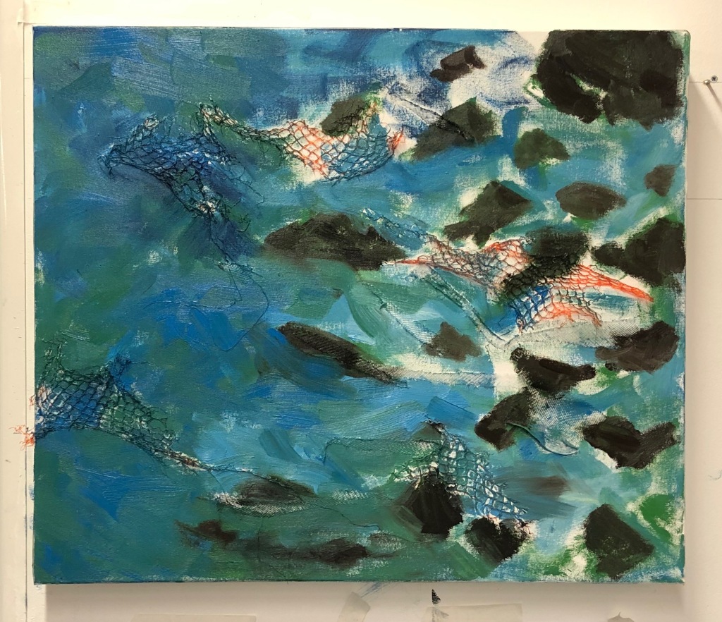
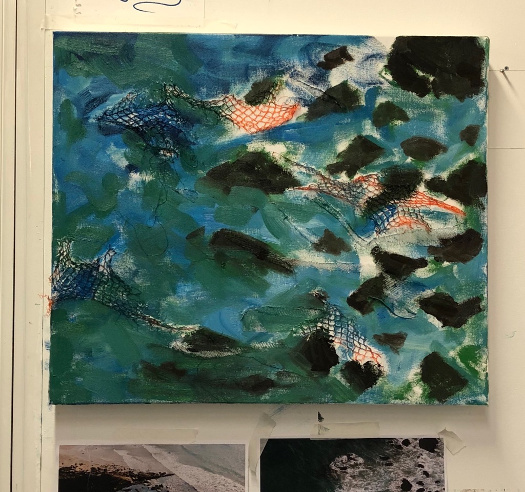
Overview of outcome
Close up 3 (showing plastic pieces)
Close up 4 (showing plastic pieces)
Close up 5 (showing plastic pieces)
Close up 6 (showing plastic pieces)
Close up 7 (showing plastic pieces)
Close up 8 (showing plastic pieces)
Positives of the process:
Applying more texture to the background than in Hidden dangers 2 worked well due to the size of the canvas. It also helped over-emphasise my concept by making the plastic netting obvious to the viewer.
Painting thinly to begin with to create the base layer worked brilliantly again and prevent the composition from appearing too chaotic (textured), especially as I use an impasto style of painting on top of the background layer.
By exploring possible colour combinations on photoshop, I made the decision to paint this composition in predominately green hues to firstly creating depth within the composition. This is because the green hues amongst highlights of blues makes the sea appear deeper. I also wanted to mainly use green hues to represent the concept of recycling. As my practice is all about the huge issue of plastic pollution, I felt that using a lot of green hues, especially light greens like the recycling logo would emphasis this concept. This makes the green hues within the composition a signifier, in the form of a symbol, helping the viewer make the connection between the sea and plastic within the painting and the green hues.
Creating different shades of greens by mixing different tones of greens with blues and white paint worked well in creating light and dark tones to convey the light the shade in the composition. Colour influence by photoshop experiments and Freya Horsley.
Due to the large size of the canvas and the nature of my painting style, I had to keep stepping back to see my progress. This was necessary and helped me create a coherent composition.
Negatives of the process:
When applying layers of colour with the palette knife, areas of my composition appeared messy and confusing. Therefore, using a larger paint brush to gently blend the colours together fixed this issue and made the sea look like it had movement.
Overall, I am really pleased with this outcome. I found this composition challenging to paint due to the large scale and different colour palette. As I normally predominately use blue hues, changing my palette to mainly green hues was a challenge but I adopted.
I am impressed with the plastic netting in the background. I like how it is visible and aids in communicating my concept without being too visually distracting to the viewer.
I am really pleased with all my outcomes within the Hidden Dangers series and I can’t wait to keep developing my concept next term.
I began by adding plastic netting on to the canvas with primer and PVA glue
I then began adding in the block colours in oil paint thinly.
Painted in roughly the rocks.
I began to add the darker tones to the piece. I applied the paint thickly with one brush and used another larger brush to gently blend tones together. This worked really well in blending colours together carefully.
I continued painting in the same style. I then used a palette knife to add different shades of blues and then the white water from the crashing waves and ripples.
Close up 1
Close up 2
Close up 3
Close up 4
I then took the canvas off the wall and began carefully applying the cut up plastic bottle pieces. As the oil paint had just been added I was able to place the small plastic piece on top of the paint. I am basically using the paint as a form of glue. I kept applying plastic and hanging it back and evaluating the piece to find areas that needed more. I then noticed parts of my composition looked a little too blue so I added light green tints and dark blue (Prussian blue) tints with a palette knife and thin paintbrush to emphasis the light and dark shades.
Close up 5 (with plastic pieces on)
Close up 6 (with plastic pieces on)
Close up 7 (with plastic pieces on)
Close up 8 (with plastic pieces on)
Close up 9 (with plastic pieces on)
Close up 10 (with plastic pieces on)
Close up 11 (with plastic pieces on)
Close up 12 (with plastic pieces on)
Again, I was focusing on portraying to the viewer the hidden dangers of plastic pollution – the plastic breaking down in the sea and entering the food chain. I also wanted to produce a larger painting to invite the viewer into the piece.
Positives of the process:
Slowing down my process of painting and applying the layer thinly to begin with and blending them carefully has really enhanced the appearance of my painting. It has made the work appear more realistic as well as adding depth to the piece.
Painting in layers starting with thin layers and ending with using a palette knife worked brilliantly. The palette knife is perfect for creating the effect of waves crashing against the rocks. The palette knife also allows me to drag the paint across the canvas carefully, creating the motion of the waves and ripples.
Adding grey tones into the rocks prevented them appearing too bold and distracting to the viewer.
Carefully dragging my larger paint brush over the smaller rocks – semi-covering the shape of the rock with the sea water paint to make it look like the rock is just under the surface of the sea worked really well. Occasionally the brown paint from the rock smudged outwards but this was easily scrapped away or covered. (Shown in close up 6 and 7)
Adding small amounts of plastic netting to the background of the piece (like I did in my experiments) helped create the texture of the waves and rocks. It also makes the viewer aware of my concept, as they will notice the plastic netting and make the connection between the plastic and the ocean, hence the issue of plastic pollution. I have ensured this message will come across by again adding lots of small plastic pieces of a water bottle on top of the paint. I applied them all over the canvas but also ensured that I placed a lot of them closely together, so the viewer will be easily able to notice them. Especially when the light hits them. I decided to place them closer together than in my last piece to ensure they were easily noticeable and hence conveying my concept successfully. I also ensured that they weren’t too visually distracting as I want the viewer to be amazed by the beauty of the sea portrayed then shocked at the plastic within it, when they get up closer to the piece. This resembles how some people see the sea as only being beautiful as the plastic pollution is not always visible and by ensuring the piece coveys beauty and horror is exactly what I want to make the viewer question plastic pollution and their treatment of single use plastics.
Putting masking tape around the edges of the canvas to prevent it being covered by paint was a great idea as it will make the piece look very professional and neat when on display.
Negatives of the process:
I don’t have any negatives at the moment. I am very happy with the piece as it displays all the successful processes I found during my experiments.
Overall, I am very pleased as I believe the composition conveys the issue of plastic pollution well in two ways. One thing to consider is maybe adding other colours in. I will experiment with this on photoshop and take it from there.
Sketched out the rough outline of the composition in oil paint
I then began adding in colours in blocks
I began adding in shading, with different sized paint brushes
I then added highlights using a palette knife
I continued to add highlights and shadows to the sea and rocks to ensure the composition looked aesthetically pleasing. I had to add a lot more dark tones to create depth in the foreground.
Close up 1
Close up 2
Close up 3
Close up 4
Close up 5
Positives of the process:
After evaluating my preparatory, experimental pieces, where I had included lots of plastic into the background of the composition. I decided to focus on the hidden dangers of plastic. When plastic is broken down by sunlight and wave action it turns into micro-particles. This is then ingested by grazers in the zooplankton, meaning it has entered the food chain. I wanted to convey this within my work. Therefore, after thinking up of new ideas I decided to cut up plastic bottles into tiny pieces of plastic that I mixed into paint and also carefully placed onto of the paint.
I also decided to reduce the amount of plastic within my painting, as I have received a lot of feedback commenting on the aesthetic nature of my painting style in conveying the energy of the sea. Therefore, I decided to trial it with this idea.
Placing small pieces of plastic on top of the paint, has worked relatively well. They can only be seen from close up, which I believe adds to my concept and message as the micro-plastics are hidden dangers. However, I did notice from certain angles where the light hits the small pieces of plastic, it makes them more easily visible to the viewer. Therefore, I should consider using a light to hang above the painting to make the plastic more easily viewable.
Using the palette knife to create the movement of the waves worked incredibly well, as well as adding texture and depth to the piece.
Negatives of the process:
Mixing the plastic into the oil paint wasn’t very successful as it is really difficult to see the plastic within the paint when on the canvas. In one respect this can be seen as a good thing as resembling the actual problem. However, for the purpose of my art I want the viewer to be able to see the small plastic pieces within my painting to enhance my message and allow it to be conveyed easily. Therefore, I strategically placed small pieces of the plastic on top of the paint.
Overall, adding small pieces of plastic to the painting seemed to work well. However, I need to try experimenting with a lamp to enhance the appearance of the piece. I am also really happy with the chosen composition, by editing my photograph and allowing artistic licence, I was able to portray a semi-realistic sea view. I am really excited by this idea and can’t wait to develop this further.
Because I have had problems with the base of the white water I decided to start from scratch with it. Therefore I ripped and cut out the plastic with the paint on at the bottom of the white water.
Using different shades of blues and greens I filled in the base of the wave. I used Whitney Knapp Bowditch’s wave paintings as inspiration. I found this really helpful and it enabled me to successfully complete this painting. Using a palette knife I quickly swept the paint over the canvas to re-create the effect of a crashing wave. This time though I didn’t drag the white paint all the way down. I also added a few more highlights into the main body of the wave before using thinned white oil paint (with turps) to flick on the canvas to create the spray.
Positives of the process:
I am so happy and pleased with myself for persevering and find a solution to this painting. Trying lots of different methods worked well but researching other artists when I was in need is what really helped me fix this painting by inspiring me with ideas.
The white water looks like it has movement and that it is crashing, which is amazing! I am so pleased. Taking away the plastic at the bottom of the white water with lots of paint on it, really helped this piece be successful.
Overall, I am very pleased that I have finally finished this painting. Not only that but it works relatively well in conveying my concept. However, I think the crashing wave may be slightly too distracting for the viewer, preventing them from seeing the importance of plastic pollution within the piece. I think my other compositions of purely ripples in the sea and rocks seem to work best in conveying my concept effectively.
The video shows her process and reasoning for doing it. She says people are often intrigued by the appearance of her pieces and shocked when they find out where they are sourced.
As mentioned I needed to let my oil painting dry before adding highlights and shadows. This is what I did today.
By adding highlights and shadows within the composition (chiaroscuro) I was able to add depth and convey the energy of the ripples in the sea.
Painting alongside the ridges, made with the crumpled plastic, worked really well in emphasising the depth within the composition.
Outcome
I learnt from this piece that manipulating the plastic to create the ripples in the sea works really well in enhancing the quality of the piece. I need to take this information forward. However, next time I need to ensure I don’t use as much plastic and have it sticking off the surface too much as parts of this composition appear clumsy because of this issue.
As previously mentioned I wanted to explore ways to incorporate plastic into my paintings. Therefore, I cut up plastic bottles into small pieces to represent the plastic breaking down in the ocean via the sunlight and movement of the waves. By associating factual evidence within my composition I am making the connection between the ocean and the plastic pollution obvious.
The images above show close ups of the plastic on top of my ink painting.
Positives of the process:
The plastic is clearly noticeable, especially when the light shines on it. This makes it easily noticeable to the viewer.
Negatives of the process:
Using PVA glue was not strong enough, so I had to re-glue a lot of the plastic pieces with a hot glue gun afterwards.
I am unsure of the aesthetic appearance of the plastic pieces. I feel they are a bit clumsy looking. Maybe if I had cut the pieces smaller it would look better.
Overall, an interesting test. Cutting up plastic did work, just next time if I reuse this method I need to cut the plastic up smaller.
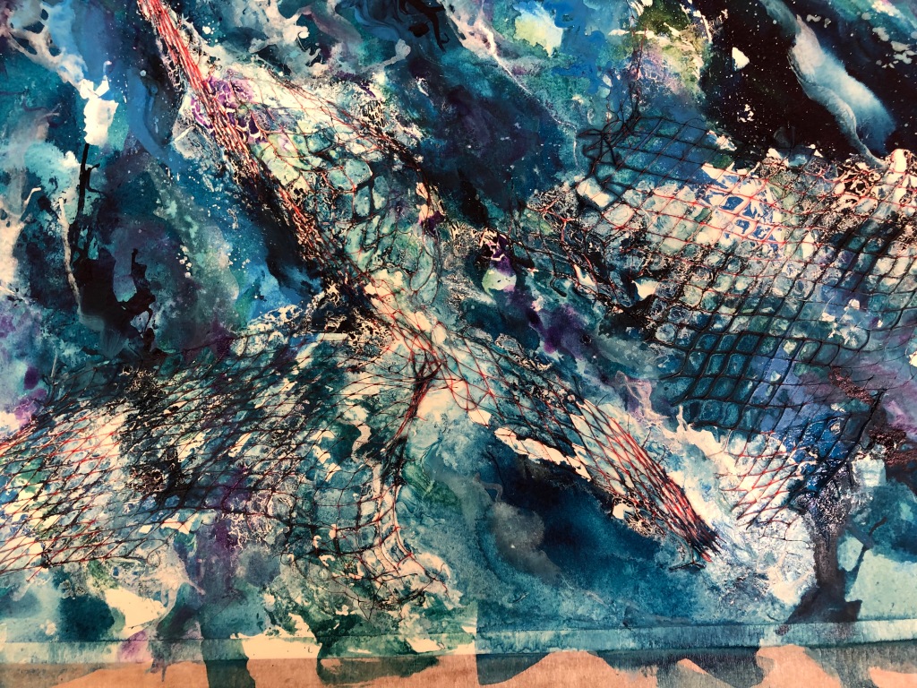
I decided to conduct another experiment using acrylic inks and plastic. This time I used watercolour paper and glued plastic netting onto the surface. I then repeated the same process as before using water and acrylic inks with a paint brush to create the sea. The use of the plastic netting makes the viewer aware of my concept, conveying the huge issue of plastic pollution.
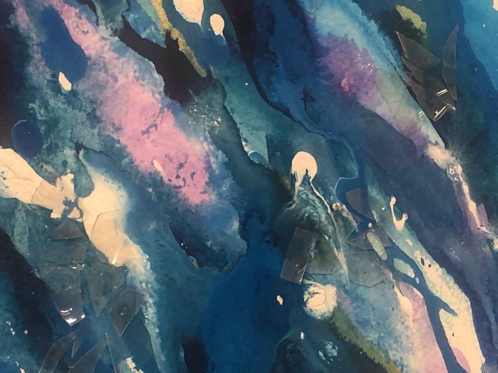
Overview
Close up 1
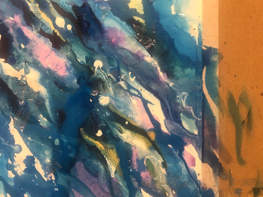
Close up 2
Close up 3
Positives of the process:
Using the inks on watercolour paper instead of plastic worked so much better, as anticipated.
Glueing the plastic netting onto the surfaced worked brilliantly in emphasising plastic pollution in the ocean. The netting and painting of the sea are icons, which allows the viewer to make the connection between the two and understand the the importance of plastic pollution.
Using a paint brush and water to create the appearance of the sea, in an abstract style, is very intriguing due to the bright colours used and the overlapping marks.
Negatives of the process:
Even though the composition is interesting to view, it does appear quite flat, due to the nature of the medium. Therefore, I am unsure whether to continue exploring the use of acrylic inks within my project. I am currently thinking that oil paints may be better suited to conveying my concept, but I am not sure at the moment.
Overall, another fun and informative experiment. Even though the outcome of this piece is successful, in the fact that it conveys my message (of plastic) and also provides the viewer with an aesthetic composition of the sea – what I wanted, to show the beauty of the sea and the damage we are causing through plastic pollution. I am unsure which direction to go in at the moment, whether to take these ink painting further or oil paintings. I few more experiments are needed.