


Positives of the process:
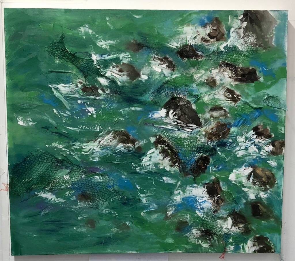
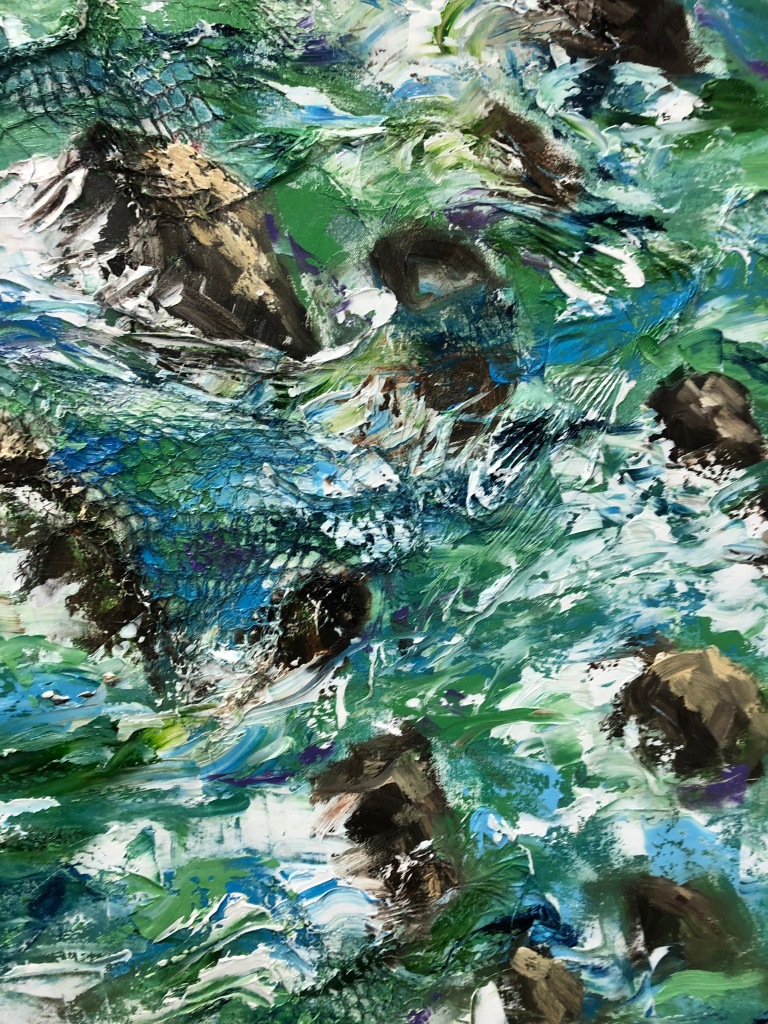
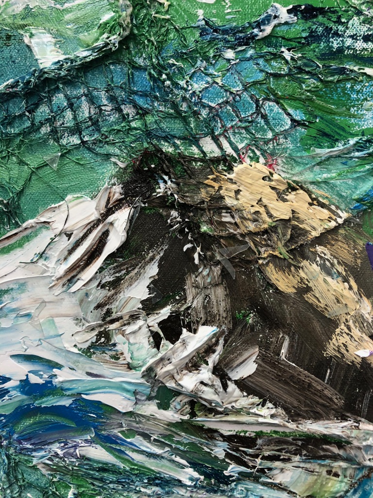
- Applying more texture to the background than in Hidden dangers 2 worked well due to the size of the canvas. It also helped over-emphasise my concept by making the plastic netting obvious to the viewer.
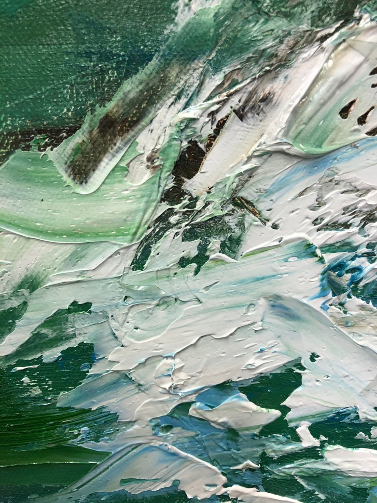
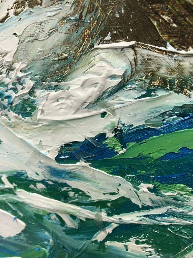
- Painting thinly to begin with to create the base layer worked brilliantly again and prevent the composition from appearing too chaotic (textured), especially as I use an impasto style of painting on top of the background layer.
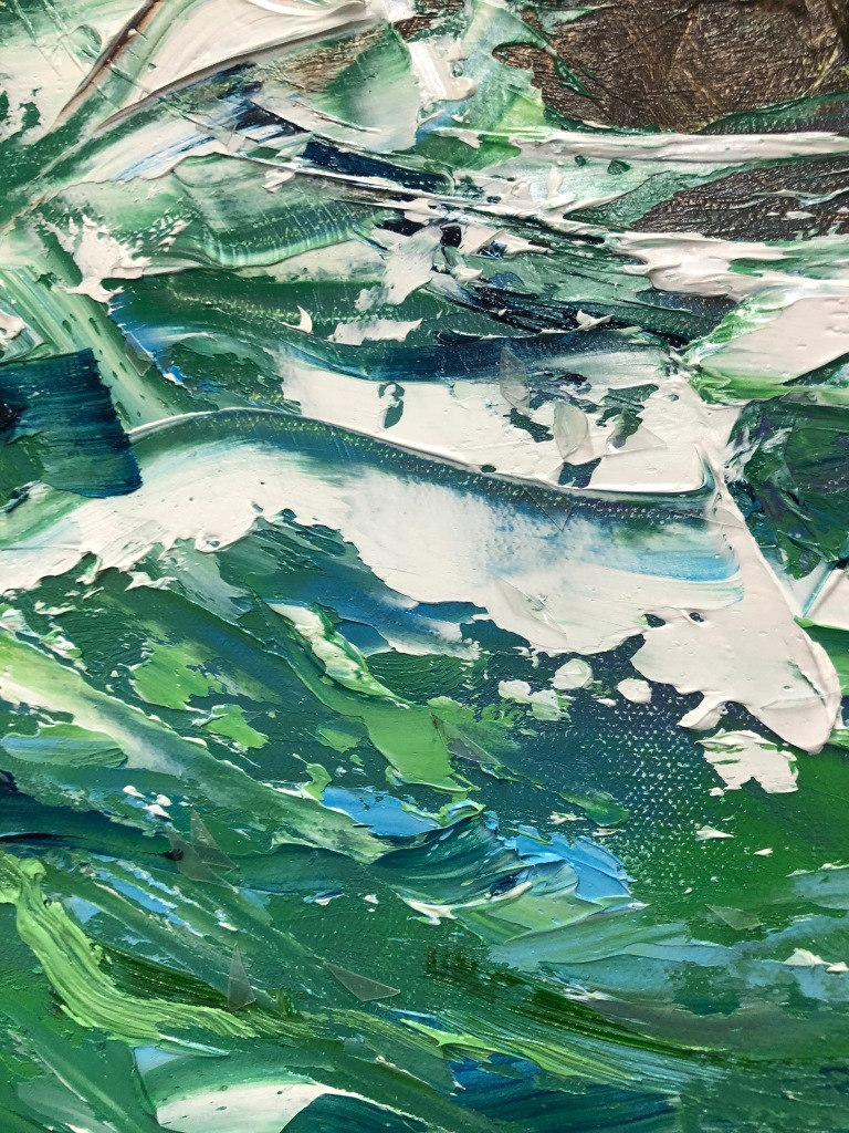
- By exploring possible colour combinations on photoshop, I made the decision to paint this composition in predominately green hues to firstly creating depth within the composition. This is because the green hues amongst highlights of blues makes the sea appear deeper. I also wanted to mainly use green hues to represent the concept of recycling. As my practice is all about the huge issue of plastic pollution, I felt that using a lot of green hues, especially light greens like the recycling logo would emphasis this concept. This makes the green hues within the composition a signifier, in the form of a symbol, helping the viewer make the connection between the sea and plastic within the painting and the green hues.
- Creating different shades of greens by mixing different tones of greens with blues and white paint worked well in creating light and dark tones to convey the light the shade in the composition. Colour influence by photoshop experiments and Freya Horsley.
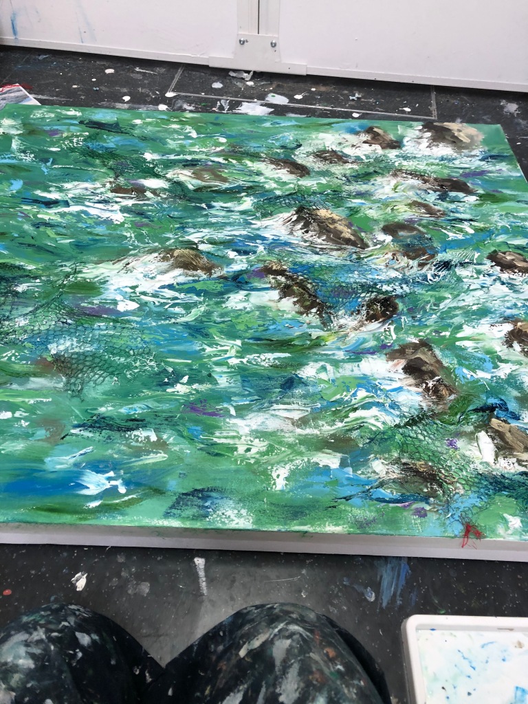
- Due to the large size of the canvas and the nature of my painting style, I had to keep stepping back to see my progress. This was necessary and helped me create a coherent composition.
Negatives of the process:
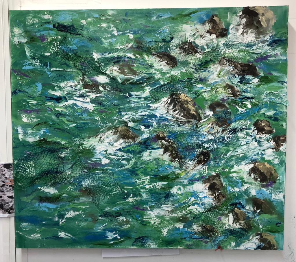
- When applying layers of colour with the palette knife, areas of my composition appeared messy and confusing. Therefore, using a larger paint brush to gently blend the colours together fixed this issue and made the sea look like it had movement.
Overall, I am really pleased with this outcome. I found this composition challenging to paint due to the large scale and different colour palette. As I normally predominately use blue hues, changing my palette to mainly green hues was a challenge but I adopted.
I am impressed with the plastic netting in the background. I like how it is visible and aids in communicating my concept without being too visually distracting to the viewer.
I am really pleased with all my outcomes within the Hidden Dangers series and I can’t wait to keep developing my concept next term.
